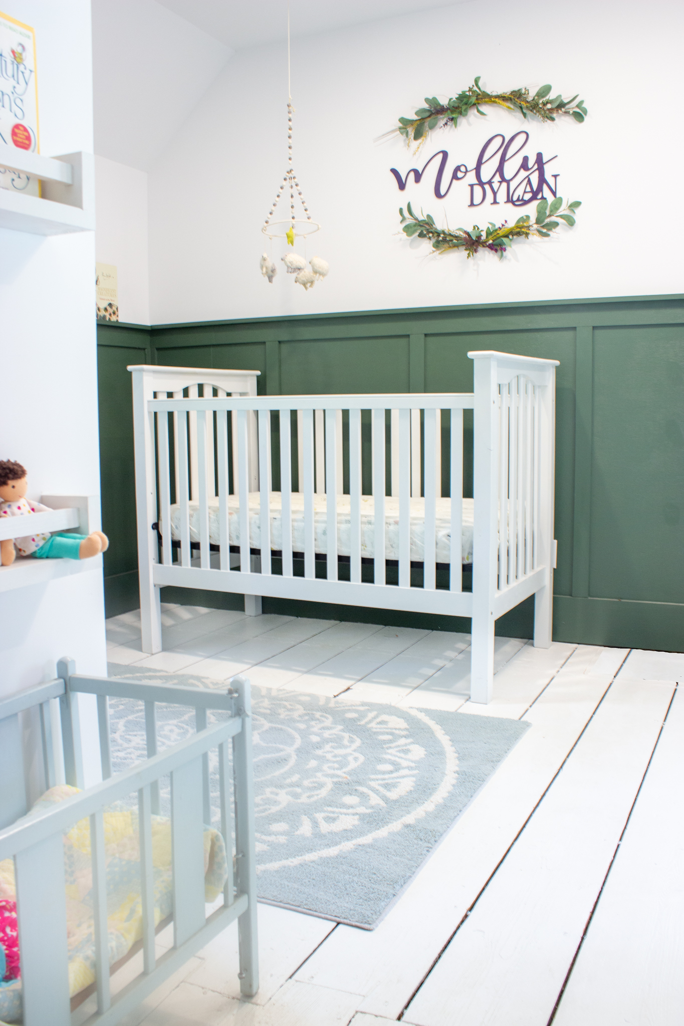
We are so excited to finally share pictures of our baby girl’s nursery! As my last post explained, she was born about a month early and we were SO not prepared for that to happen. Both Ronan and I tend to be overly optimistic about most things, which sounds sweet, but can lead to real trouble when situations like this arise. Although we didn’t have a finished nursery to come home to, what we did have was a general plan and a couple of Pinterest photos for inspiration.
We knew that we wanted to use this opportunity to flex our creative design muscles a little bit. We love, love, love neutrals and try not to lean too much into trends, but this nursery just seemed like a good place to break our own rules. We knew that it was a room that would probably change and evolve faster than the other rooms in our house, since the baby living in it would also be changing and growing quickly (too quickly!!). We also already had a lot of white nursery furniture from when our son was a baby and since we are cheap frugal green, we were sure we wanted to reuse that furniture. Instead of using our usual white paint and putting the white furniture in front of it, we thought this would be the perfect opportunity to try out a dark wall color.
Upstairs Update
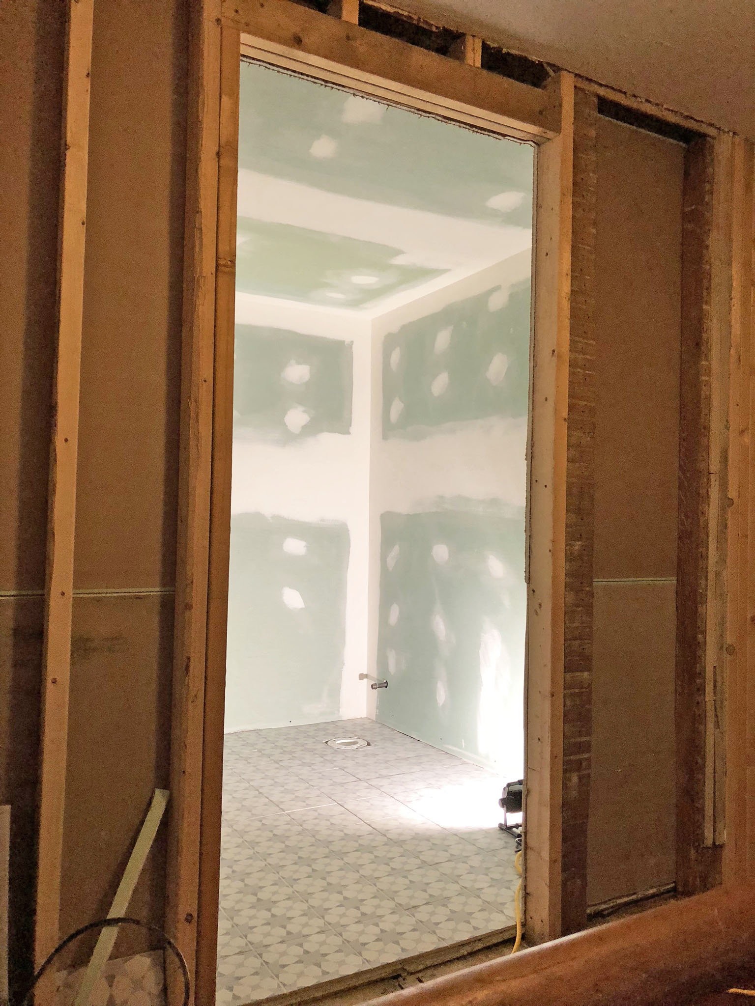
We promised we would be back with an update on our guest bathroom and here we are! We are excited because the bathroom is actually almost completely done! In this renovation process, while the end result is to make this house as beautiful as we assume it once was, there is a lottttt of making things messier and less beautiful first before we can restore or renovate them. It can be pretty discouraging at times, but then a room or a project gets completed and it provides us with enough motivation to dive headfirst into our next project. Thank goodness because we still have a lot of work left to do.
If you have an amazing ability to remember useless details, you might remember that we had to change up the second story floorplan completely in order to make room for two new bathrooms. The second floor of the house had very little original detail. In fact, we had a friend who is an architectural historian come by a while ago and he believes the upstairs wasn’t actually original to the house at all. He believes the house started out as two rooms (now the living room and dining room) and everything else was added on in stages over many years. In addition to the upstairs being a later addition to the house, the rooms have been pretty chopped up over the years, so we don’t feel too guilty about changing them up further to better suit the needs of a 21st-century family (in our opinion.)
The “Original” Floorplan and The New Floorplan

Hi everyone! It’s been a while (an inexcusably long while, to be honest) but we are so excited to be back and ready to fill you in on everything that has been going on around this old home of ours! We thought that the beginning of the new year was a perfect time to pretend we didn’t abandon the blog for the last 4 months give you a recap of everything that has been going on around here that we mightttt have been neglecting to update you on. While we have made a fair amount of progress on our to-do list in recent months, we still have a long way to go and lots of design decisions that we would love your help with. We are going to break the progress down into smaller sections instead of doing one giant post, so we will start exactly where we left off.
As a refresher, we asked you to vote on which color we should paint the foundation of our house. The winner was white and we promptly got to work making your wishes come true. We ended up loving the way it turned out. You can judge the final product for yourself in the before and after pictures below.
.
