Why vote?
People have asked me many times since we started our blog why we decided to let other people make decisions about our home instead of just doing it ourselves. It’s a good question and we have a number of answers. One is, as we have said before, we don’t love making decisions ourselves and this takes that burden away. Thank you for that, dear readers and voters! Another is, someday we will want to sell this house (more on when “someday” might be in this post) and the more opinions we get from all of you, the more likely we are to consider every opinion of a potential buyer. Another is, as personal as home decisions may be, there are many people who read this blog who have experiences and/or training that I do not have and they are kind enough to share ideas and knowledge that I wouldn’t have access to without this forum. I am SO grateful for that. That said, whether you are formally trained in something design related, have experimented with your own house, or just spend a lot of time watching HGTV- we value your feedback and opinions so much and hope that you will keep sharing them with us.
On our last blog post, we showed off our baby girl’s nursery and the response was amazing. We are so grateful for each and every one of you who took the time to check out our work. We are still floored by the positive feedback we received from all of you! You made us feel so special! Thank you, thank you, thank you.
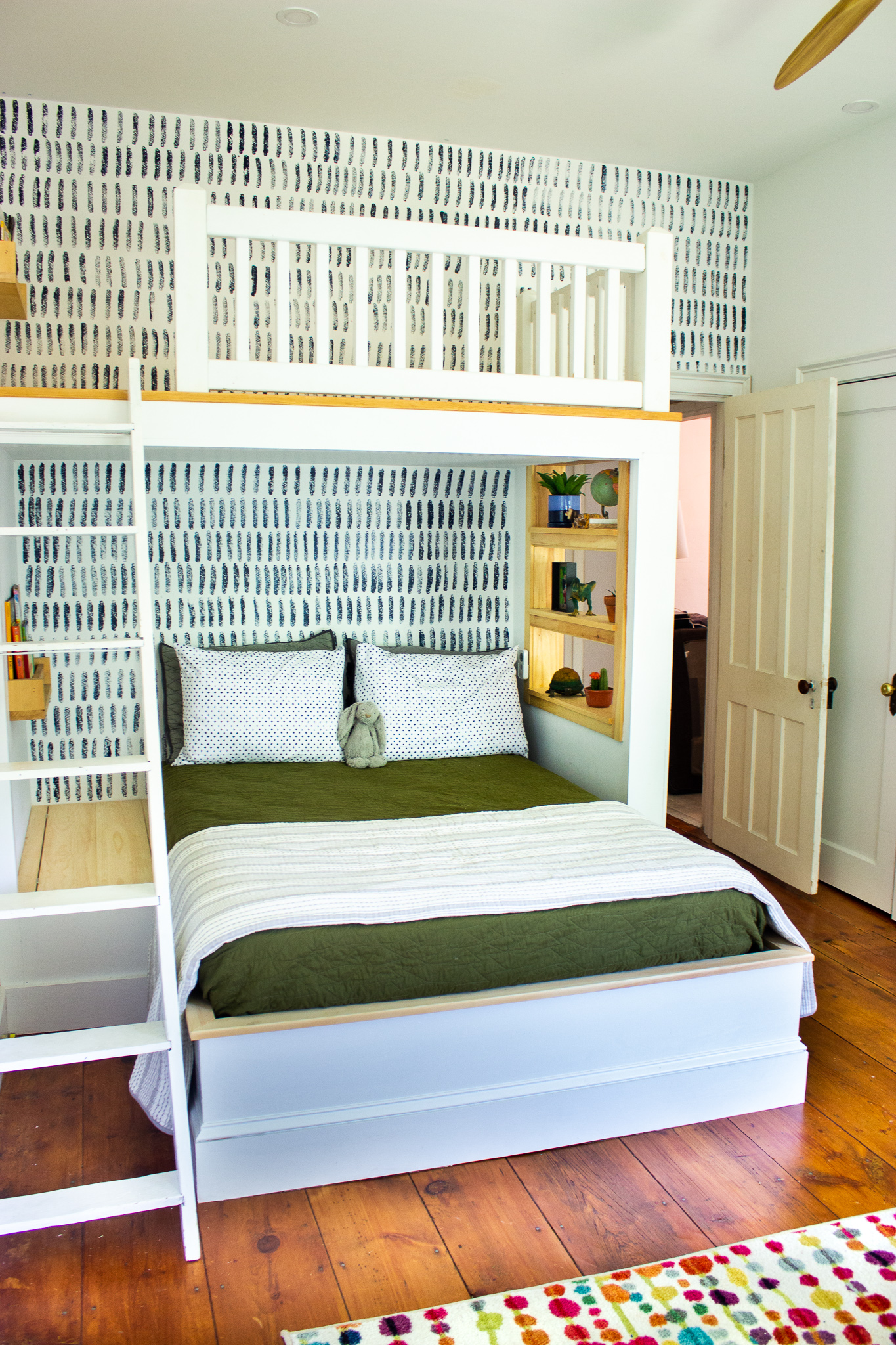
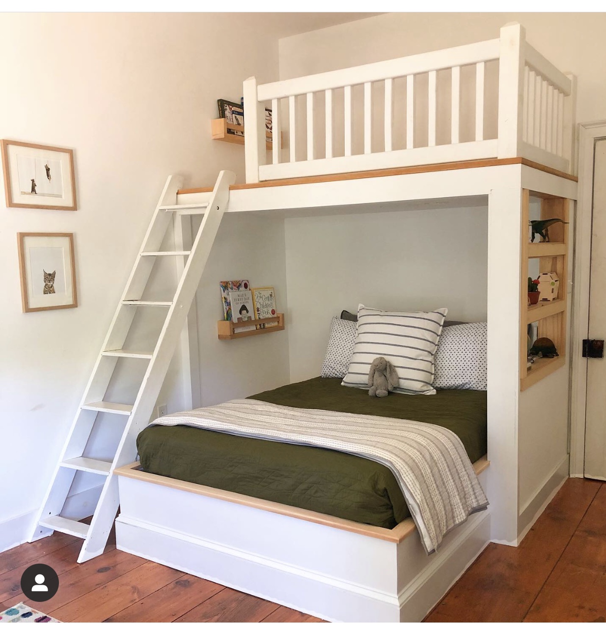
Now, instead of giving you a full tour of our son’s bedroom, we would like to first ask for your help with making a fairly big decision. If you have been around for a while, you remember that we took a vote last year on whether or not to build a loft in our son’s bedroom. Originally, we thought for sure that every single person would vote “yes” but then the votes started coming in and you guys really surprised us. For a while, we thought the loft was quite possibly going to be voted down. In the end, you voted for happiness the loft and all was right in the world.
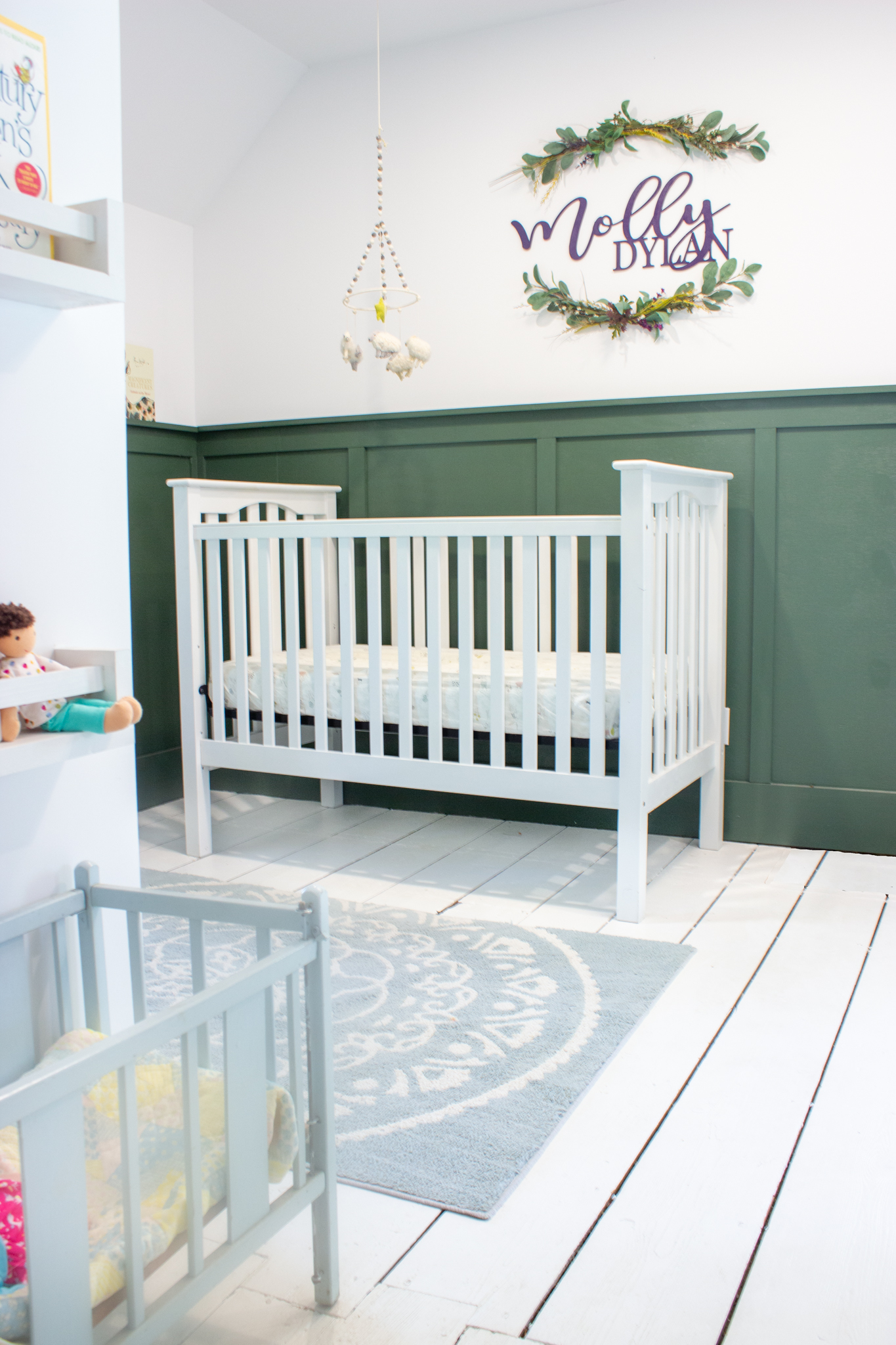
We are so excited to finally share pictures of our baby girl’s nursery! As my last post explained, she was born about a month early and we were SO not prepared for that to happen. Both Ronan and I tend to be overly optimistic about most things, which sounds sweet, but can lead to real trouble when situations like this arise. Although we didn’t have a finished nursery to come home to, what we did have was a general plan and a couple of Pinterest photos for inspiration.
We knew that we wanted to use this opportunity to flex our creative design muscles a little bit. We love, love, love neutrals and try not to lean too much into trends, but this nursery just seemed like a good place to break our own rules. We knew that it was a room that would probably change and evolve faster than the other rooms in our house, since the baby living in it would also be changing and growing quickly (too quickly!!). We also already had a lot of white nursery furniture from when our son was a baby and since we are cheap frugal green, we were sure we wanted to reuse that furniture. Instead of using our usual white paint and putting the white furniture in front of it, we thought this would be the perfect opportunity to try out a dark wall color.


