There is a lot we love about the first floor and also a lot that we don’t at all plan on changing. The first floor is what really sold us on this house because it is where most of the original detailing and character are located. Here is a (blurry) floor map of the layout.

Our favorite things about the first floor:
› The wide floorboards throughout the living room, dining room, and entryway
› The molding
› The large windows and the views out of them- our neighbors directly across from us have the most beautiful house and that was a huge selling point for us. It provides daily inspiration!
› The pocket doors (!!!)

› The built-in corner cabinet in the dining room
› The detailing on the front door
› The transom window above the front door
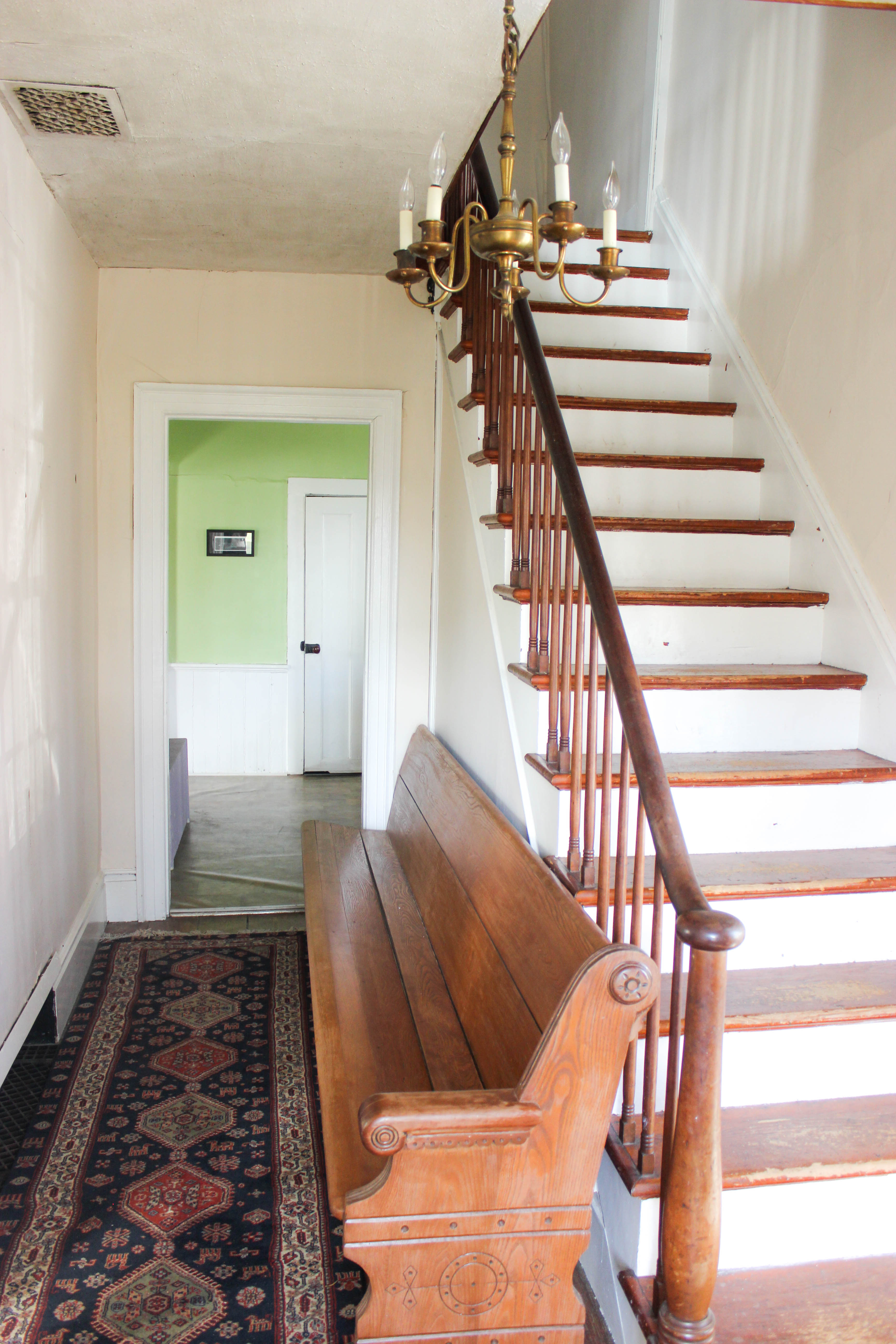
› The traditional entryway with stairs

Now, what needs to change?
› That Kitchen- I know this is a pretty broad improvement, but almost everything about the kitchen should probably be changed. The size is awesome, but the layout forces all of the cooking, dishwashing, and everything else that a kitchen is made for, to happen in a tiny corner. Most of the room is just dead space. We want to open it up and spread all the important stuff out a bit. We need more counters and more cabinets and fewer random chimneys, fake beams, broken windows, fake bricks…you get the idea. I am pretty sure that in our naive planning days we decided that we would reno and redo the kitchen as soon as we moved in. I remember a conversation that went something like, “We don’t need a kitchen in the summer anyway! We will just barbeque every night until fall! Yay!” Since then, we realized we needed to level the floors and install radiators and (fast forward a solid 17 months) here we are today, still living the green paint and orange countertop life. I bet not too many people can claim the same…don’t be jealous.

› The location of the bathroom- As I mentioned in my “things we like” section, I find the traditional entryway, with its wide hall and staircase to be absolutely beautiful. When you are standing in it, I think it feels breezy and sunny and awesome. Then your eyes travel down the hall and into the kitchen and BOOM! A door. An ugly, bathroom door, assuming you are lucky enough for the door to be closed. With a nosy intrusive curious 3-year-old running around, the odds are at about 50% that it will be open. In that case, a person can actually stand in our front yard and be staring at a pile of laundry on top of the washer. That is a best case scenario. I will spare you the worst case scenario, but you get it…the bathroom should probably be moved.
› The walls- They were badly damaged before we moved in and now they are on a whole new and terrible level, thanks to our floor leveling project. They all need to be patched, skim-coated, and painted.
› Some window panes need to be replaced.
› Exterior walls could use some more insulation.
› The stove and mantle area need some sort of serious attention.

› Light fixtures need to be replaced.
› Ceilings need to be redone.
› The pocket doors need to be fixed so they can slide open and closed easily.
› I really want to put a window back into the dining room where I assume there used to be one, but Ronan isn’t feeling it. We will see how that one plays out!
Thanks for following along! Up next, we plan on focusing in on the dining room and we want your ideas on how to best transform that mantle. We already replaced the stove with another one (pictures coming on the next post!) and we would like to keep the mantle, but bump out the wall behind it so that the stove doesn’t look like it is sticking out so much. We have a couple of ideas about what we think the mantle should look like, but we would love to hear if you have any ideas for paint colors, cool design features, etc. Like usual, we aren’t totally sold on our own ideas yet, and would love to hear what all of you would suggest! (Did you guys know that one of the primary reasons we created this blog was actually to get ideas from you? If you missed it, check out our The People and The House page to see what we are talking about!)
-
That is the hallway I have always wanted.
-
Who drew that killer floor plan? Can’t wait for the next update!
-
Was thinking he same thing Sierra lol. Ronans architect is JB is he cheating on him?
-
-
Would it be possible to move the doorway to the bathroom? If you could move it to the right side wall, next to the kitchen outside doorway (would have to move the bathroom sink). You may be able to make that a little entryway/mud room with the bathroom door on the right as you come in the back door. Could put in a bench and a peg rack. Just a thought.
-
Forgot to add: This is a beautiful house and can’t wait to watch your progress as it becomes your home.


9 Comments